Sunday, March 12, 2017

Special Edition : Kyle Baker Gallery

Favorite: Most to Least

1.
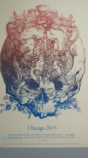
This image was my favorite among those at the gallery. What caught my attention the most is the optical illusion in the center of the image as when looked in a certain way it seemed as though it moved. I also liked how the hues complimented and contrasted with each other. 


2.
My next favorite was this image because the way the images come together to form one larger design. I also found it interesting how values of the hues change transition into a new color as you look from the top to the bottom of the design. 
 3.

What caught my eye the most in this image is how there is so much contrast between the hues. And the fact the words are used to make up the image really draws attention.
 4.
As with the second image, the transition of the values of the color is eye catching to me. The layout of the word was interesting. I also liked how the artists utilized the wheels of the bike to add more to the design by incorporating more images.
 5.
The colors seemed to ho well with one another as the gold stood out among the gray background. The layout of the images and the words made the center of the image the focus.


Wednesday, March 1, 2017

Week 8- 9 Variations


For this week's project, I had to create 3 unique designs and then for each design make 3 variations for a total of 9 designs. To make each unique I used different hues and changed the values so that there was some contrast. When I need a word or letter to standout more I change the outer lining or the fill of that letter so it didn't blend in with the background. The different fonts also helped in making each its own, and to further distinguish the designs I used different brush strokes on some of the letters I created.

Tuesday, February 21, 2017

Week 7- 2 Logos- SXU Is the 99% and Fume Busters

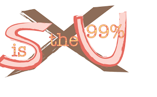
The purpose of this project was to create two logos for each concept given. In order to create each design I used the pen tool and the shape builder tool that allowed me to manipulate shapes into their own unique design. With the black pointer tool I was able to move different parts around and change colors while the white pointer tool allowed for me to further smooth out my designs. By applying different brush strokes I was able to further give each design its own unique look.

Tuesday, February 14, 2017

Week 6- Logos

Original

Recreation

Remix

Original

Recreation

Remix

Original

Recreation

Remix


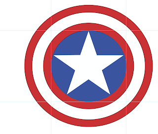
The purpose of this project was to choose at least 3 logos, and then not only recreate them but also to remix the design and change it to something new. To do this, I had to download the original image and then make my own vector art of it. From there with various tools, such as the pen, brush stroke, and white pointer tool, I adjusted different parts of the design with the intention of making a new design by adding different elements from a different color to readjusting lines and shapes.

Tuesday, February 7, 2017

Week 5- Before & After ABCs


For this project I had to use the pen tool to create the alphabet that looked similar in shape and size, and then I had to create my own style.  To do this I used the pen tool and  added anchors to different parts of the lines on the letters in order to manipulate the shape, and change it into its own style. 

Tuesday, January 31, 2017

Week 4- Letters

Using the pen I created the alphabet with lines by clicking to create the shape. Eleven of the letters required me to click and drag with the pen to be able to make the curves. For some of the letters I had to go back, and smooth out the rough edges in order get them look similar. This required to me to sometimes use pen tool and anchors or delete them in order the shape. With white pointer tool, I was able to manipulate the shape and change things to how I needed them to look.

Tuesday, January 24, 2017

Week 3-25 objects


 I wanted to take the original design and make it different, so I chose various styles that stood out from one another. With different brushes I was able to morph the original design into something new.  Some of the styles caused the original design to have shading to it which led the objects to look more 3-dimensional. The different styles cause the eyes to be drawn to different parts of the design, some cause the eyes to be more drawn to the left or right sides while other designs bring more attention to the middle.