Sunday, April 30, 2017

Special Edition- Art Institute

Of the artworks viewed, I find that this piece titled Ballet Dancers by Henri de Toulouse-Lautrec was my least favorite. For me, with the the blue hues being similar in saturation and value it made it hard to tell the concept was at first.  It took a few, longer glances to tell what was being shown as at first I did not even notice the dancer in the back of the painting, nor was I able to tell that it was a hand in the foreground.  Although I did find it interesting that the dancer were placed in way that draws the eye from the top corner to the bottom.

Meekness (Douceur or Mansuétude) by Eustache Le Sueur was among favorites. Though the yellow hue is a prominent color in the painting, it draws the viewers eye to the pink at the center, I find that interesting as it lets you know that that is what you should first focus on as the background fades away, Next, when I look at the painting, I notice the lamb next as the white hues does not contrast as well with the yellow as the pink does. 


Week 15- Comparative Analysis

When watching the two films, I noticed a parallel between two of the artist displayed in the films:

                -Thierry Guetta (Mr. Brainwash)

                -Jack Kirby

Both of these artists did not start out with their own style or craft, as Thierry Guetta owned a store and filmed as a pass time while Jack Kirby worked under a comic company and was in charge of a specific part of a comic. While Guetta was drawn into the street world through a relative, Kirby felt limited by his position and later left the company. Eventually both developed their own identifiable styles that were inspired from the work of others, the main similarity is that they put something behind them in order to move forward. Though as Guetta is a street artist and Jack Kirby comic artists the tools they use and approach to their art is different.

Tuesday, April 18, 2017

Week 14- Revised Deck


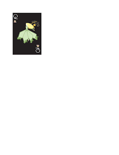
When I revised my cards, I took in consideration the advice given to me in the group critique. Rather than struggle with that dark I decided to get rid of it completely and have all cards be black which, as suggested, helped with keeping the consistency of the cards with variance being the suits and the face cards being in different positions. I also decided to redesign one of my suits as was told it did not make as much sense when it came to my theme and the design itself was hard to read so I replaced it with an image butterfly as it would be more recognizable. I also designed the back of the card, and took in suggestion to use darker hues, so I used a dark saturated violet that would not only be a dark hue but still stood out from the black background of the front cards, When it came to the design itself, I tried to use brush strokes that I used in the illustrations so that it would keep a consistent style.  

Week 13- Full Deck Before Revision


By continuing with a similar process, through use of master pages that allowed me to reuse the same format over and again, I was able to complete my deck in a way that allowed me to have a design that is consistent. When it came to the face cards, I copied and pasted the image in place so that the placement was similar and to avoid them being in a different position, and I used a similar approach when it came to placing the suits. I also attention to the advice that was given in critique and change the saturation of the green in the flower design. I attempted to change the red, but failed to get a complete change, and it will be something I pay attention to in the revision process.


Tuesday, April 4, 2017

Week 12-Half the deck


The purpose of this assignment was to create 26 cards with designs that are consistent with one another one and were also different in some way. Through using master pages I was able to keep a similar style but by assigning different master pages I was able to change certain aspects so that I could also make each card different. In order to keep each suit in a similar place I used guides so I would know where to place each image.