Tuesday, March 28, 2017
Week 11- Next 3 Illustrations with Variations
Keeping along with the style of my previous illustrations, I used a similar approach by once again creating shapes that would come together and form one image and attempted to use similar brush strokes. I also tried to keep the saturation of the colors similar and that the hues contrasted with one another.
Week 10- First Three Illustrations With 3 Variations
For each illustration, I decided to form an image through use of multiple shapes. With the variations I played with the colors and different brush strokes to see how it affected the overall design of the design. I tried to use brush strokes that looked similar so that each design looked consistent with one another.
 |
Tuesday, March 14, 2017
Week 9- Research On Card Games
1.Comet Game
 |
| Played with standard deck, each card has a different value and five cards are dealed at a time. |
 |
| Two or more players with a standard deck. each player has their own hand of seven cards while the other cards are placed in a center pile. |
Memory
 |
| Game for two or more players, objective is to match cards and the player to collect the most matching cards win |
Standard deck of cards, players attempt to avoid getting the lowest value, in this case the Ace, Players continuously change cards until one ends up with the lowest value
Speed
 |
| Two players, each have 5 cards in hand while others go in the designated format displayed above, goal of the game is to get rid of all cards in hand, 5 cards must be in hand at all times. |
 |
| Players face off against one another, goal is to win all cards in deck, |
I doubt it
 |
| Players bluff one another in attempt to be rid of all cards in hand. |
 |
| Players goal is have a hand of cards that equals 31. Each card has its own value, |
Sunday, March 12, 2017
Special Edition : Kyle Baker Gallery
Favorite: Most to Least
1.
2.
1.
2.
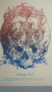
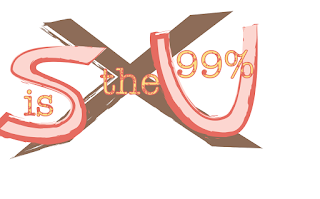
What caught my eye the most in this image is how there is so much contrast between the hues. And the fact the words are used to make up the image really draws attention.
4.
As with the second image, the transition of the values of the color is eye catching to me. The layout of the word was interesting. I also liked how the artists utilized the wheels of the bike to add more to the design by incorporating more images.
5. |
| The colors seemed to ho well with one another as the gold stood out among the gray background. The layout of the images and the words made the center of the image the focus. |
Wednesday, March 1, 2017
Week 8- 9 Variations
For this week's project, I had to create 3 unique designs and then for each design make 3 variations for a total of 9 designs. To make each unique I used different hues and changed the values so that there was some contrast. When I need a word or letter to standout more I change the outer lining or the fill of that letter so it didn't blend in with the background. The different fonts also helped in making each its own, and to further distinguish the designs I used different brush strokes on some of the letters I created.
Subscribe to:
Comments (Atom)


