sperez-cgs17
Sunday, April 30, 2017
Week 15- Comparative Analysis
When watching the two films, I noticed a parallel between two of the artist displayed in the films:
-Thierry Guetta (Mr. Brainwash)
-Jack Kirby
Both of these artists did not start out with their own style or craft, as Thierry Guetta owned a store and filmed as a pass time while Jack Kirby worked under a comic company and was in charge of a specific part of a comic. While Guetta was drawn into the street world through a relative, Kirby felt limited by his position and later left the company. Eventually both developed their own identifiable styles that were inspired from the work of others, the main similarity is that they put something behind them in order to move forward. Though as Guetta is a street artist and Jack Kirby comic artists the tools they use and approach to their art is different.
Tuesday, April 18, 2017
Week 14- Revised Deck
Week 13- Full Deck Before Revision
Tuesday, April 4, 2017
Week 12-Half the deck
Tuesday, March 28, 2017
Week 11- Next 3 Illustrations with Variations
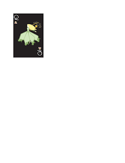
Keeping along with the style of my previous illustrations, I used a similar approach by once again creating shapes that would come together and form one image and attempted to use similar brush strokes. I also tried to keep the saturation of the colors similar and that the hues contrasted with one another.
Week 10- First Three Illustrations With 3 Variations
For each illustration, I decided to form an image through use of multiple shapes. With the variations I played with the colors and different brush strokes to see how it affected the overall design of the design. I tried to use brush strokes that looked similar so that each design looked consistent with one another.
 |
Subscribe to:
Comments (Atom)


